Use of hand drawn illustrations and typography in web designing has been there for quite some time. The main motto behind using illustrations and typography was to give websites a non digital look and adding a more humanly touch. The trend started by Microsoft in 2007 with launch of Zune has returned strongly.
With increasing mobile internet users, scaling of websites to smaller designs always had always been a problem area. So scalablity is one of main reasons to adopt a flat design. It makes designs fit elegantly, gives a great look great and is user friendly on small screens. With the emerging trend the use of graphic heavy websites may come to end at-least for a period. So, we thought it would be great capturing 50+ great examples of websites using drawing and illustrations, in-case they are soon replaced by minimalism, flat colored responsive websites. Enjoy!!
Don't miss out reading our previous posts
Beautiful Travel Tourism Websites
30 Flat Grid Based Websites
Web Designs of 2012
10 Words
Adline
Art Attack
Beavory
Boompa
Bootb
Bowtie
Camellie
Carnet Ordinaire
Carsonified
Christian Sparrow
Clever Craft
Crayons Life
Creative Binge
Creative Week
Dax and Alice
Dean Oakley
Denise Chandler
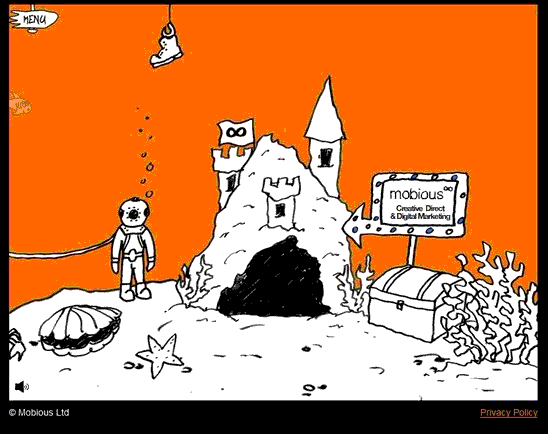
Emobious
Esteban Muñoz
Fat Heads Studio
High on Pixels
HTML5 Lab
Hugs for Monsters
It Looks Good
Jesus Rodriguez Velasco
If You are enjoying Like us either on
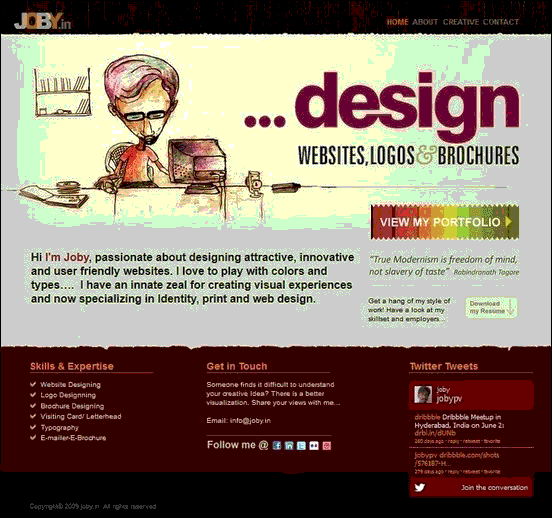
Joby
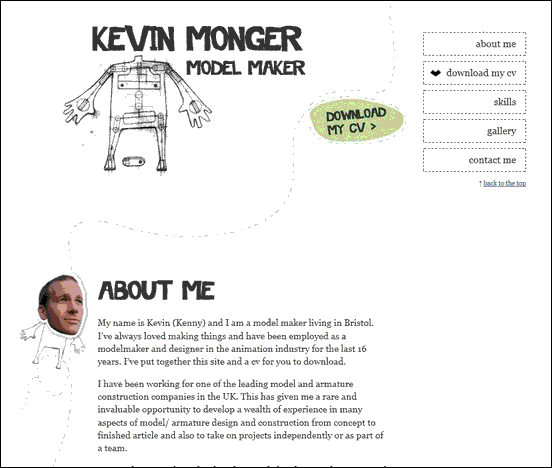
Kevin Monger
Kez Jukebox
Kinetic V5
Kusoyama
KutzTown
Legwork Studio
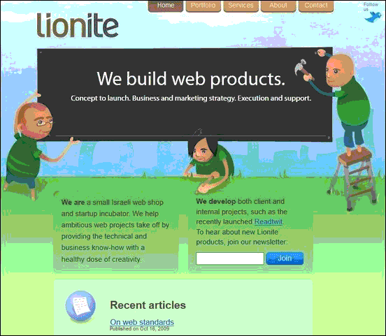
Lionite
Lucuma
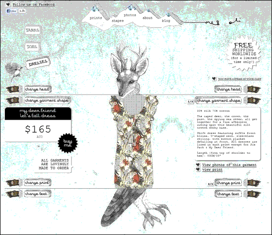
Me and Oli
Miki Mottes
MplusZ
N.Design-Studio
Natrashka
Robbin Waldemar
Sebastian Mrakez
Snailbird
SR28
T.Freak
Toasted Digital
Toucouleur
XHTML Café









0 comments :